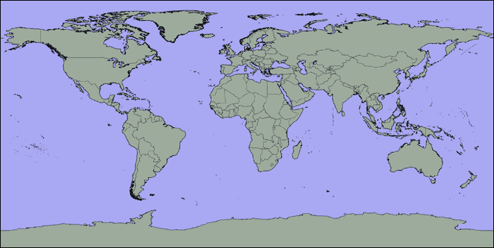
The maps show airports worldwide used in constructing a picture
of global temperature increases from normal. These sample charts show
the comparison of observed and normal temperatures
during the two weeks ending July 1, 2013.
• Position cursor over a dot to see airport description.
• Click on the dot to bring up the location's Daily Temperature Cycle
chart in a new window.
• When finished viewing the charts you select, close them by using
"X-Out" on the pages in Internet Explorer, or
on their tabs in Mozilla Firefox.
• To back up from here to the preceding Web page, click
Back
-- or use your browser's "back" arrow.
|
|